Think about how you use the internet. Chances are, you are reading this on your mobile phone. Your customers in India are doing the same. If your business website is not easy to use on a small screen, you are losing customers. It's that simple. The first step to fixing this is running a mobile friendly website test india businesses can trust. This guide will walk you through why it matters and what you need to do.
Why a Mobile-Friendly Website is No Longer Optional
In the past, having a mobile website was a 'good-to-have' feature. Today, it is essential. Google uses what it calls 'mobile-first indexing'. This means Google primarily looks at the mobile version of your website to decide how to rank it in search results. If your mobile site is slow, broken, or hard to read, your ranking will suffer, even for people searching on a desktop.
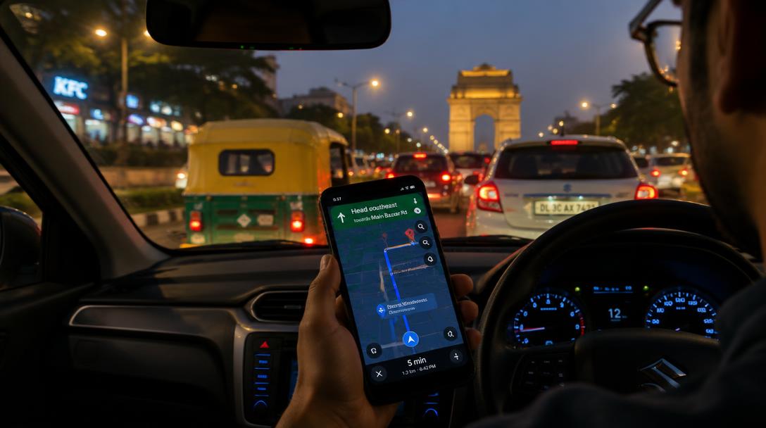
For any Indian business, especially those targeting customers in metro areas like Delhi NCR, your audience is overwhelmingly on mobile. A frustrating mobile experience means they will simply tap the 'back' button and go to your competitor. A smooth mobile site, on the other hand, builds trust and leads to more business.
A Quick Mobile Friendly Website Test India Business Owners Can Do
You don't need to be a technical expert to do a basic check. Just follow these steps:
- Open your website on your phone: Don't just look at the homepage. Click on a few product or service pages. Try to fill out your contact form. Is it easy?
- Check the text: Can you read all the text comfortably without having to pinch and zoom in? If you have to zoom, the font is too small.
- Tap the buttons: Are the buttons and links large enough to be tapped easily with a thumb? Are they spaced far enough apart to avoid accidental clicks?
- Look at the speed: How quickly does the site load on a mobile data connection, not just on your office Wi-Fi? A few seconds of delay can cause visitors to leave.
These checks reveal real usability issues. Google's Mobile-Friendly Test has been retired. Use PageSpeed Insights and Chrome Lighthouse for performance diagnostics, then test navigation and enquiries on a real phone. A score alone does not establish whether a customer can complete the task.
Key Elements of a Truly Mobile-First Design
If your website fails the quick test, it likely needs some work. A modern, mobile-friendly website focuses on a few core principles:
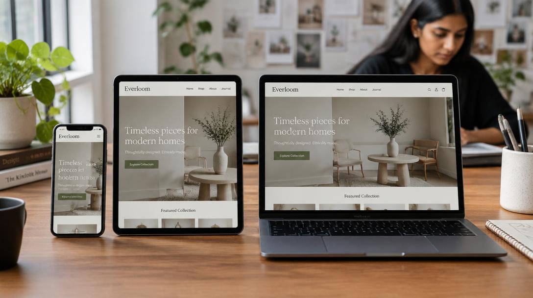
- Responsive Design: This is the most important element. A responsive website automatically adjusts its layout to fit any screen size perfectly. It's one website that works everywhere.
- Fast Loading Speed: Mobile users are impatient. Your website needs to be light and fast. This involves optimising images, using efficient code, and choosing good hosting. Getting these technical details right is a core part of our SEO services. In fact, if you need a fresh start, we can launch your business website in 10 days.
- Simple Navigation: Complicated menus don't work on small screens. Use a simple 'hamburger' menu (the three stacked lines) and ensure your contact information and key services are easy to find.
- Thumb-Friendly Design: People browse with their thumbs. Place key buttons and links where they are easy to reach.
Beyond Google: Preparing for AI Search (GEO/AEO)
Search is changing. AI tools like ChatGPT, Gemini, and Google's own AI Overviews are becoming new ways for customers to find information. These AI engines also crawl your website to find answers.
A mobile-friendly website is an AI-friendly website. Why? Because they both prefer content that is simple, well-structured, and easy to understand. Clear headings, simple paragraphs, and lists (like the ones in this article) make it easier for AI to read and cite your information.
Preparing your site for this new reality is called AI search optimisation (also known as GEO or AEO). Technical elements like Schema markup (code that explains your content to search engines) become even more important. It helps tell the AI exactly what your business does, where you are located, and how to contact you, increasing your chances of being featured in an AI-generated answer.
Your Checklist for a Mobile-Friendly Website Test in India
Feeling overwhelmed? Don't be. Here is a final checklist to get you started on the path to a better mobile website:
- Do the 'Thumb Test': Browse your own site on a phone. Is it a good experience?
- Use current diagnostics: Check PageSpeed Insights and Chrome Lighthouse, then verify the actual mobile enquiry journey. These tools do not guarantee rankings.
- Check Your Speed: Use an online tool to test your website's loading speed on a mobile connection.
- Review Your Content: Is your text readable? Are your headings clear? Is your most important information easy to find?
- Think About AI: Is your business information structured in a way that an AI could easily understand and recommend you?
Fixing your mobile website is one of the highest-impact things you can do for your business online. If you need help figuring out the next steps, you can find more guides on our blog or talk to our team for a free, no-obligation plan to improve your site.
FAQs: Mobile friendly website test india
What is the difference between mobile-friendly and mobile-responsive?
A mobile-friendly site could be a separate, simplified version of your main site (e.g., m.yourwebsite.com). A mobile-responsive site is one single website that automatically changes its layout to fit any screen. Today, responsive design is the industry standard and what we strongly recommend.
How does a mobile-friendly site help my local SEO in Delhi NCR?
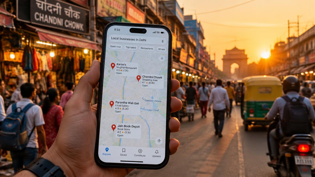
Many local searches, like 'interior designer near me', happen on mobile devices. If a customer in Delhi finds you on Google Maps but your website is difficult to use on their phone, they will likely choose a competitor. A good mobile experience is vital for converting those local searchers into actual customers.
How much does it cost to make my website mobile-friendly?
The effort required depends entirely on your current website's technology and structure. For some sites, it might be a few simple fixes. For older sites, a complete redesign might be the most effective solution. The best way to find out is to have a chat with us. We can review your site and provide a free action plan with no commitment required.
People also search for
- how do i check if my website works well on mobile?
- why is my website slow on mobile data?
- how can i fix text that is too small on phones?
- what should i check before launching a mobile friendly website?
- how do i make website forms easier to fill on a phone?
Related topics