
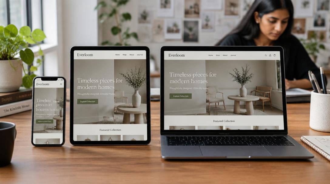
India is a mobile-first country. Responsive website design means your website adapts perfectly to every screen, from budget Android phones to large desktops. If your site breaks on mobile, you are losing customers every day.
What Responsive Website Design Means
A responsive website rearranges layouts, images and text automatically for each screen size, so visitors never need to pinch and zoom.
Google Mobile-First Indexing and Rankings
Google mainly uses the mobile version of your website to decide rankings. A poor mobile experience directly hurts your SEO. Combine responsive design with strong SEO services.
Mobile Website Design Best Practices
- Large, tappable buttons
- Short forms with phone number first
- Compressed images for slower networks
- Sticky WhatsApp or call button
Testing a Responsive Website Before Launch
Test on real devices, including low-cost Android phones and slower 4G connections.
FAQs: Responsive website design
How do I know if my website is mobile-friendly?
Open it on several phones and check loading speed, readability and whether buttons are easy to tap. Tools like Lighthouse also help.
Is responsive design more expensive?
No. Any modern website development project should include responsive design as standard.
Does mobile design affect Google rankings?
Yes. Google uses mobile-first indexing, so mobile experience directly affects your rankings.
People also search for
- why is mobile first design important in india
- how to check if my website is mobile friendly
- what is the difference between responsive and mobile first design
- why does my website look wrong on a phone
- how to make website forms easier to use on mobile
Related topics